


Dunexa
PROJETO DE BRANDING
PT A Dunexa é uma empresa de engenharia elétrica que precisava se reposicionar para ser considerada pelas grandes indústrias do Paraná como um player capaz de fazer todo o processo de elétrica de uma indústria, desde o começo.
Através da metodologia INDEX a Porto encontrou a essência da marca e detectamos ajustes na prestação do serviço. Entendemos que o grande diferencial era ser um ponto de flexibilidade em um setor tão engessado e cheio de processos.
A mudança de chave foi comunicar a marca como uma ferramenta para impulsionar negócios, ao fornecer eletricidade e inteligência de dados, a indústria está pronta para operar no setor das indústrias 4.0.
A identidade visual ganhou corpo com o uso do azul marinho, que trouxe a solidez necessária para o tipo de serviço oferecido, e a dinamicidade do laranja. O símbolo reforçou a vitalidade da marca com o uso do vórtice, que coloca a indústria em movimento, o uso de caixa baixa evidencia a forma próxima como a marca se relaciona com seus clientes.
A base da linguagem visual é modular e permite que se encaixe em qualquer formato, reforçando a capacidade de adaptação da empresa. A identidade verbal é acessível e ao mesmo tempo forte e solucionadora.
EN Dunexa is an electrical engineering company that needed to reposition itself to be considered by large industries in Paraná as a player capable of carrying out the entire electrical process of an industry, from the beginning.
Through the INDEX methodology, Porto found the essence of the brand and we detected adjustments in the provision of the service. We understand that the big difference was being a point of flexibility in a sector so rigid and full of processes.The key change was to communicate the brand as a tool to drive business, by providing electricity and data intelligence, the industry is ready to operate in the Industry 4.0 sector.The visual identity took shape with the use of navy blue, which brought the necessary solidity for the type of service offered, and the dynamism of orange.
The symbol reinforced the vitality of the brand with the use of the vortex, which sets the industry in motion, the use of lower case highlights the close way in which the brand relates to its customers.The basis of the visual language is modular and allows it to fit into any format, reinforcing the company's ability to adapt. Verbal identity is accessible and at the same time strong and resolving.


APRE
PROJETO DE BRANDING
PT Temos muito orgulho de fazer parte do momento de transformação da Associação das Empresas de Base Florestal, que tem mais de 50 anos de muita atuação no setor.
Ao iniciar o projeto percebemos que os desafios do reposicionamento eram grandes. Era preciso trazer uma nova visão do setor florestal, muito mais tecnológica e relacionada à bioeconomia, a economia do futuro. Ao longo dos seus anos de história o setor se transformou, assim como a atuação da instituição, mas isso não era comunicado pela marca.
Ao iniciar o projeto percebemos que os desafios do reposicionamento eram grandes. Era preciso trazer uma nova visão do setor florestal, muito mais tecnológica e relacionada à bioeconomia, a economia do futuro. Ao longo dos seus anos de história o setor se transformou, assim como a atuação da instituição, mas isso não era comunicado pela marca.
A base da linguagem visual é modular e permite que se encaixe em qualquer formato, reforçando a capacidade de adaptação da empresa. A identidade verbal é acessível e ao mesmo tempo forte e solucionadora.
EN We are very proud to be part of the moment of transformation of the Association of Forestry-Based Companies, which has been operating in the sector for over 50 years.
When starting the project we realized that the challenges of repositioning were great. It was necessary to bring a new vision of the forestry sector, much more technological and related to the bioeconomy, the economy of the future.
Over its years of history, the sector has transformed, as has the institution's operations, but this was not communicated by the brand. The basis of the visual language is modular and allows it to fit into any format, reinforcing the company's ability to adapt. Verbal identity is accessible and at the same time strong and resolving.


João Paulo Nascimento
PROJETO DE BRANDING
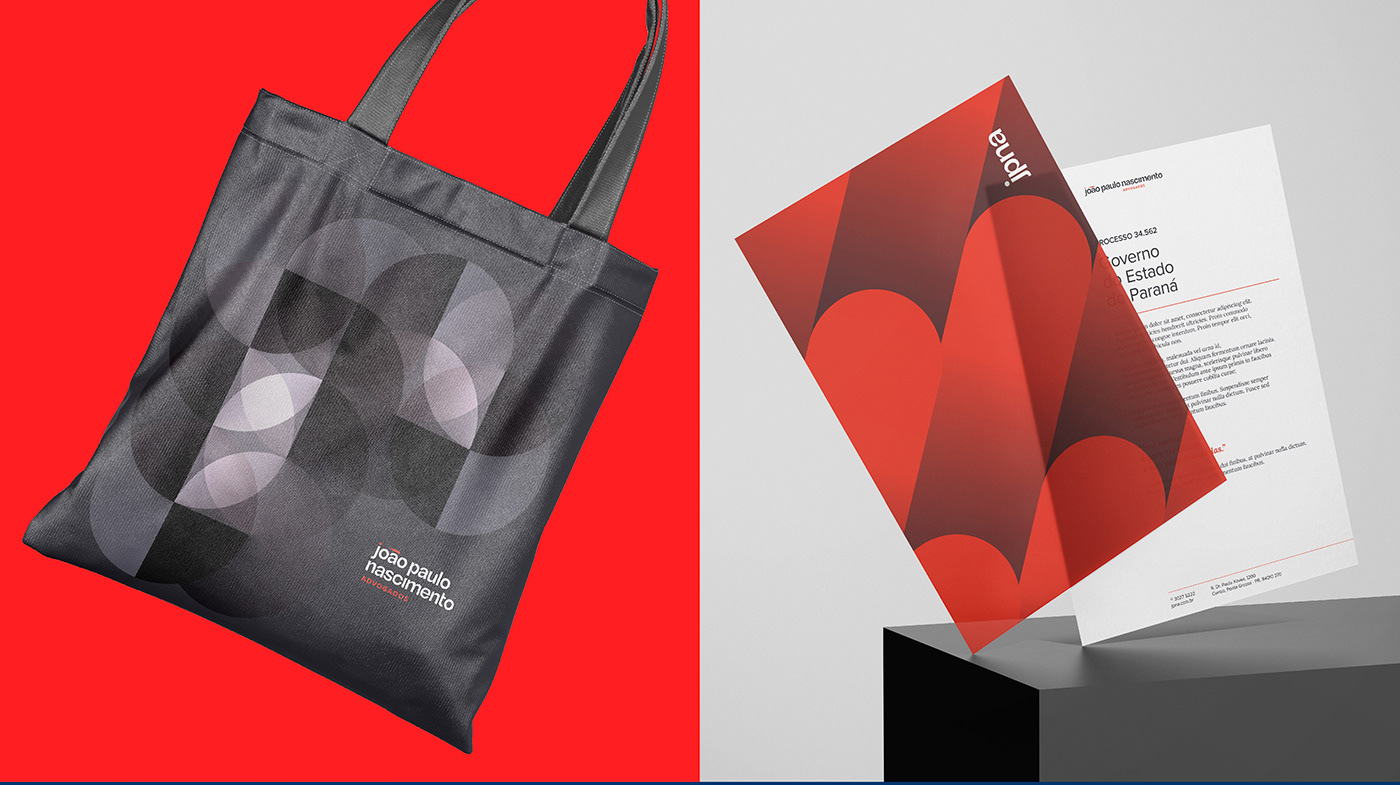
PT Não basta ser diferente, é preciso parecer diferente.
O escritório João Paulo Nascimento & Advogados entende que para estar ao lado dos empresários é preciso simplificar a linguagem e os processos, para se tornar o advogado do sim.
Desenvolvemos uma identidade visual que aproxima o escritório do mundo corporativo.
A marca em tipografia caixa baixa, deixa claro que eles estão próximos.
Sobre as cores, o chumbo traz a sobriedade do conhecimento e o laranja a energia para quebrar a inércia.
O recurso do gradiente mostra a facilidade nos processos.
A identidade verbal quebra as regras e simplifica, deixando o conteúdo compreensível para todos.
EN It's not enough to be different, you have to look different.The João Paulo Nascimento & Advogados office understands that to be on the side of businesspeople it is necessary to simplify the language and processes, to become the yes lawyer.
We developed a visual identity that brings the office closer to the corporate world.The brand in lowercase typography makes it clear that they are close.Regarding colors, lead brings the sobriety of knowledge and orange the energy to break inertia.The gradient feature shows the ease in the processes.Verbal identity breaks the rules and simplifies, making the content understandable to everyone.


Velô Autos
PROJETO DE BRANDING
PT Uma marca que é aquele melhor amigo que entende tudo de carro.
Com um nome que mais parece um apelido mostra a que veio, para facilitar a vida de quem quer trocar de carro de maneira digital.
A Velô Autos é uma plataforma exclusiva para venda on-line de carros e divulgação de produtos e serviços para veículos.
Com uma identidade visual enérgica, se posiciona como solucionadora em um setor bastante concorrido. O layout clean mostra que a interação com a plataforma é simples e fácil. O símbolo é a soma do elemento de check de algo que está resolvido, da letra V e do velocímetro.
A identidade verbal traz elementos do universo automobilístico para deixar a conversa mais interessante.
EN A brand that is that best friend who understands everything about cars. With a name that looks more like a nickname, it shows what it came for, to make life easier for those who want to change their car digitally.
Velô Autos is an exclusive platform for online car sales and advertising of vehicle products and services. With an energetic visual identity, it positions itself as a solution in a very competitive sector. The clean layout shows that interacting with the platform is simple and easy.
The symbol is the sum of the check element of something that is resolved, the letter V and the speedometer. The verbal identity brings elements from the automobile universe to make the conversation more interesting.


Fonte Sul
PROJETO DE BRANDING
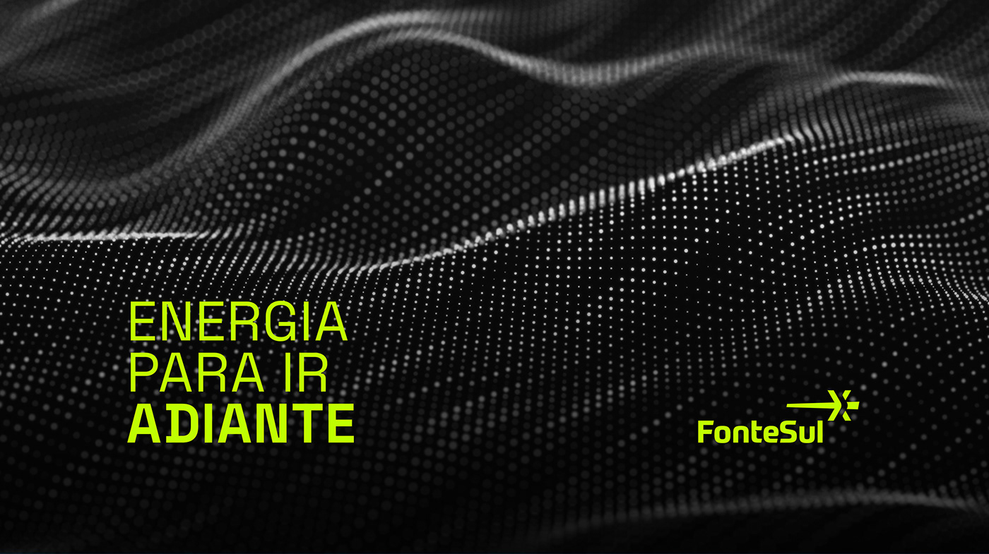
PT Especialista em geração de energia limpa, a Fonte Sul constrói usinas fotovoltaicas de grande porte. Junto com o Brasil deve se posicionar como protagonista da transição energética global, transformando a sociedade.
O projeto de branding posiciona-a como especialista em energia do futuro.
O verde neon traz a energia da mudança e o chumbo o respaldo de quem é autoridade no assunto.
Estrela é energia e quebra da inércia, na contra forma é possível ver duas flechas em movimentos contrários reforçando esse conceito.
A identidade visual é limpa, enfatizando a facilidade na interação com a empresa e a identidade verbal complementa os recursos visuais com um tom de voz que inspira e motiva e a expertise que traz resultados.
EN A specialist in clean energy generation, Fonte Sul builds large photovoltaic plants. Together with Brazil, it must position itself as a protagonist in the global energy transition, transforming society.
The branding project positions it as a specialist in future energy.Neon green brings the energy of change and lead brings the support of those who are authorities on the subject.Star is energy and breaking inertia, in the opposite form it is possible to see two arrows in opposite movements reinforcing this concept.
The visual identity is clean, emphasizing the ease of interacting with the company and the verbal identity complements the visual resources with a tone of voice that inspires and motivates and the expertise that brings results.


MEO
PROJETO DE BRANDING
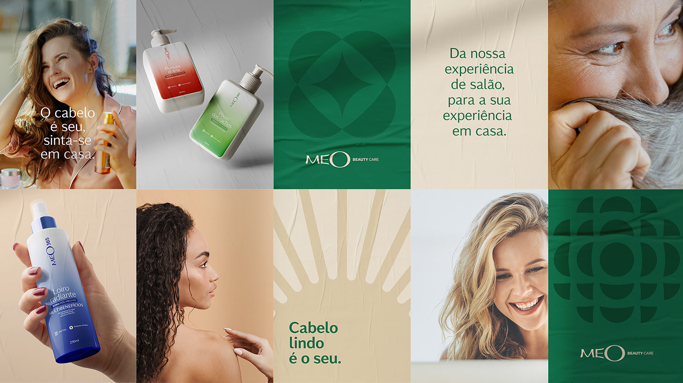
PT Sabemos que marcas de cosméticos precisam de um toque a mais de responsabilidade. Durante muitos anos a indústria foi responsável por criar padrões irreais de beleza.
Nós acreditamos que as marcas têm que ajudar a transformar a sociedade e por isso a Meo Beauty Care e a Meo 365 nascem olhando para o futuro. O nome Meo é uma é sobre o orgulho da beleza de cada um e aumenta a identificação das clientes com o "meu" salão.
"Cabelo lindo é seu" é a bandeira de quem acredita que autoestima é poderosa e move mundos, quem se ama vai além. A identidade visual contribui na identificação ao ser baseada em grafismos que representam os diferentes tipos de belezas.
Confere aqui um pouco desse case lindo e cheio de representatividade.
E aí? Qual beleza é a sua?
EN We know that cosmetics brands need an extra touch of responsibility. For many years the industry was responsible for creating unrealistic beauty standards. We believe that brands have to help transform society and that is why Meo Beauty Care and Meo 365 were created looking to the future.
The name Meo is about pride in each person's beauty and increases customers' identification with "my" salon. "Beautiful hair is yours" is the banner of those who believe that self-esteem is powerful and moves worlds, those who love themselves go further.
Visual identity contributes to identification by being based on graphics that represent different types of beauty. Check out a little of this beautiful and representative case here.
What beauty is yours?


Pictorial
PROJETO DE BRANDING
PT A Pictorial estruturou o seu negócio de comunicação visual para atender os prazos impossíveis dos departamentos de marketing, para isso trabalha com maquinário ocioso e atende demandas urgentes.
Ter a Pictorial como uma parceira é como um toque de mágica. Uma vez aceito o pedido, plim, ele será entregue conforme combinado. Esse olhar foi determinante para o entendimento do arquétipo do mago, que resolve, soluciona sem falar de processos.
Para uma postura tão ativa precisávamos de cores fortes e fluorescentes. O preto contrasta com o neon e reforça a capacidade de atendimento e o comprometimento, servindo com uma chancela de qualidade diante de tanta energia para voar.
O asterisco remete ao fato de que cada detalhe faz diferença, os cantos chanfrados reforçam ainda mais esse olhar aprofundado. A sua tridimensionalidade traz diferentes perspectivas e pluralidade de materiais e possibilidades.
A tagline foca nos diferenciais da marca, onde realizar vai além de produzir, significa fazer parte da geração de valor do cliente, e estar pronto fala sobre disponibilidade e capacidade. A identidade verbal é ativa e solucionadora. Temos ritmo de trabalho e ritmo na comunicação, com frases curtas e objetivas.
EN Pictorial has structured its visual communication business to meet the impossible deadlines of marketing departments by utilizing idle machinery and addressing urgent demands.
Having Pictorial as a partner is like a touch of magic. Once the order is accepted, poof, it will be delivered as agreed upon. This perspective was crucial in understanding the archetype of the magician, who resolves and solves without discussing processes.
For such an active stance, we needed strong and fluorescent colors. The black contrasts with the neon and reinforces the ability to meet and the commitment, serving as a seal of quality in the face of so much energy to soar.
The asterisk symbolizes that every detail makes a difference, while the beveled corners further emphasize this in-depth perspective. Its three-dimensionality brings different perspectives and a variety of materials and possibilities.
The tagline focuses on the brand's differentiators, where "achieving" goes beyond production and signifies being part of the customer's value generation. The phrase "ready" speaks to availability and capability. The verbal identity is active and solution-oriented. We have a work rhythm and communication rhythm, with short and concise sentences.


Sensae
PROJETO DE BRANDING
PT O cliente nos procurou para criar uma marca nova para uma loja de móveis planejados, após 17 anos dentro de uma franquia. Ao longo do tempo, o cliente adicionou produtos mais premium à loja, mas a percepção ficava limitada por conta da marca principal.
Após conversa com os diversos públicos, constatamos que a qualidade do atendimento e da instalação se destacavam. A criação de uma marca própria era o único caminho para aproveitar todo o potencial da loja. Era preciso trazer aspectos inspiracionais que refletissem a essência da marca para a comunicação.
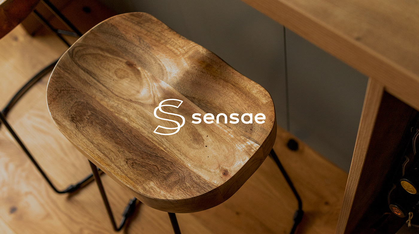
O nome Sensae diz respeito à forma acolhedora como o cliente é recebido na loja e às sensações vivenciadas em casa, ao interagir com os projetos da marca.
A combinação inusitada de roxo e verde escuro traz sofisticação para a identidade visual e o símbolo, um S formado por um traço contínuo, faz alusão aos projetos personalizados.
O traço como recurso gráfico faz alusão ao acabamento de algo escrito à mão. Esse elemento reforça o conceito da tagline “A sua essência em cada traço” onde os projetos são únicos e pensados para cada cliente.
Para a identidade verbal buscamos uma comunicação leve e inspiracional elevando a relação dos móveis a algo poético e que reflete a personalidade da família.
EN The client approached us to create a new brand for a custom furniture store, after being part of a franchise for 17 years. Over time, the client had added more premium products to the store, but the perception was limited due to the main brand.
After talking to various audiences, we found that the quality of service and installation stood out. Creating a brand of their own was the only way to fully utilize the store's potential. It was necessary to bring inspirational aspects that reflected the brand's essence in the communication.
The name Sensae relates to the welcoming manner in which customers are received in the store and the sensations experienced at home when interacting with the brand's projects.
The unconventional combination of purple and dark green brings sophistication to the visual identity, and the symbol, an S formed by a continuous stroke, alludes to the personalized projects.
The stroke as a visual element refers to the finish of something written by hand. This element reinforces the concept of the tagline "Your essence in every stroke," where the projects are unique and tailored to each client.
For the verbal identity, we aimed for a light and inspirational communication that elevates the relationship with furniture to something poetic and reflective of the family's personality.


Seu Porto no Futuro
PROJETO DE BRANDING
PT Nós sempre acreditamos que as marcas têm o poder — e o dever — de transformar a sociedade. Comprometidos com essa postura, há um ano criamos um canal de conteúdo da Porto. Nosso objetivo é aproximar temas urgentes, tendências e comportamentos do maior número de marcas possíveis.
Sabemos que esses assuntos são disseminados entre os grandes players do mercado, mas queremos que os pequenos e médios também tenham acesso. Imagina que incrível seria se a padaria do bairro pensasse no papel dela em fazer diferente? Que a loja de carros seminovos ficasse atenta à diversidade?
Juntos conseguiremos fazer as transformações necessárias para um mundo mais justo, sustentável e melhor.
Em 2022 falamos com mais de 30 pessoas, impactamos outro tanto e tivemos um feedback muito bacana da nossa comunidade. Esse ano repensamos o ecossistema de geração de conteúdo e unificamos, debaixo da marca SEU PORTO NO FUTURO.
Com essa mudança, acreditamos que ganhamos mais força. Trazemos, independente da plataforma, assuntos que poderão auxiliar pessoas e marcas a fazer diferente, repensar a realidade e promover mudanças. Esse movimento pode começar nas empresas, invadir os bairros, conquistar as cidades e reverberar na sociedade.
Na Porto as marcas começam no preto e branco da estratégia e aqui não poderia ser diferente. Nosso projeto cresceu e amadureceu. Sempre tivemos compromisso com a qualidade da informação, nível de referência e com os nomes que trazemos.
Tudo isso é representado de maneira literal pelo preto e pelo branco e pela tipografia com serifa. Verde é energia, é sair da zona de conforto. Queremos provocar, promover uma mudança, quebrar a inércia. O traço humanizado traz a leveza com que tratamos tudo isso, não porque é relevante que precisamos de um olhar maçante.
A mudança só acontece quando ela é inspiracional, quando encanta. Agora, todos os nossos canais de geração de conteúdo atendem à mesma marca. Você pode ser impactado pela live ou pode acompanhar os aprendizados no nosso blog. Fomos a um evento incrível sobre o futuro? Você vem na nossa mala. E-books, newsletters e podcasts podem vir de carona.
Vem com a gente que esse é só o começo!
EN We have always believed that brands have the power - and the duty - to transform society. Committed to this stance, a year ago we created a content channel for Porto. Our goal is to bring urgent topics, trends, and behaviors closer to as many brands as possible.
We know that these subjects are disseminated among the big players in the market, but we want small and medium-sized businesses to have access too. Imagine how incredible it would be if the neighborhood bakery thought about its role in doing things differently? Or if the used car dealership paid attention to diversity?
Together, we can make the necessary changes for a fairer, more sustainable, and better world.
In 2022, we spoke with over 30 people, impacted many others, and received very positive feedback from our community. This year, we have rethought the content generation ecosystem and unified it under the brand "SEU PORTO NO FUTURO" (Your Porto in the Future).
With this change, we believe that we have gained more strength. Regardless of the platform, we bring up topics that can help individuals and brands do things differently, reconsider reality, and promote change. This movement can start within companies, spread to neighborhoods, conquer cities, and reverberate throughout society.
At Porto, brands start in the black and white of strategy, and here is no different. Our project has grown and matured. We have always been committed to the quality of information, the level of reference, and the names we bring.
All of this is represented quite literally by the black and white, and the serif typography. Green symbolizes energy, breaking away from the comfort zone. We want to provoke, promote change, and break the inertia. The humanized stroke brings the lightness with which we approach all of this, not because it is relevant that we need a dull perspective.
Change only happens when it is inspirational, when it enchants. Now, all our content generation channels are under the same brand. You can be impacted by the live event or follow our learnings on our blog. Did we attend an amazing event about the future? You'll be coming along in our suitcase. E-books, newsletters, and podcasts can come along for the ride.
Come along with us, as this is just the beginning!


